
Camulogen
Get the font


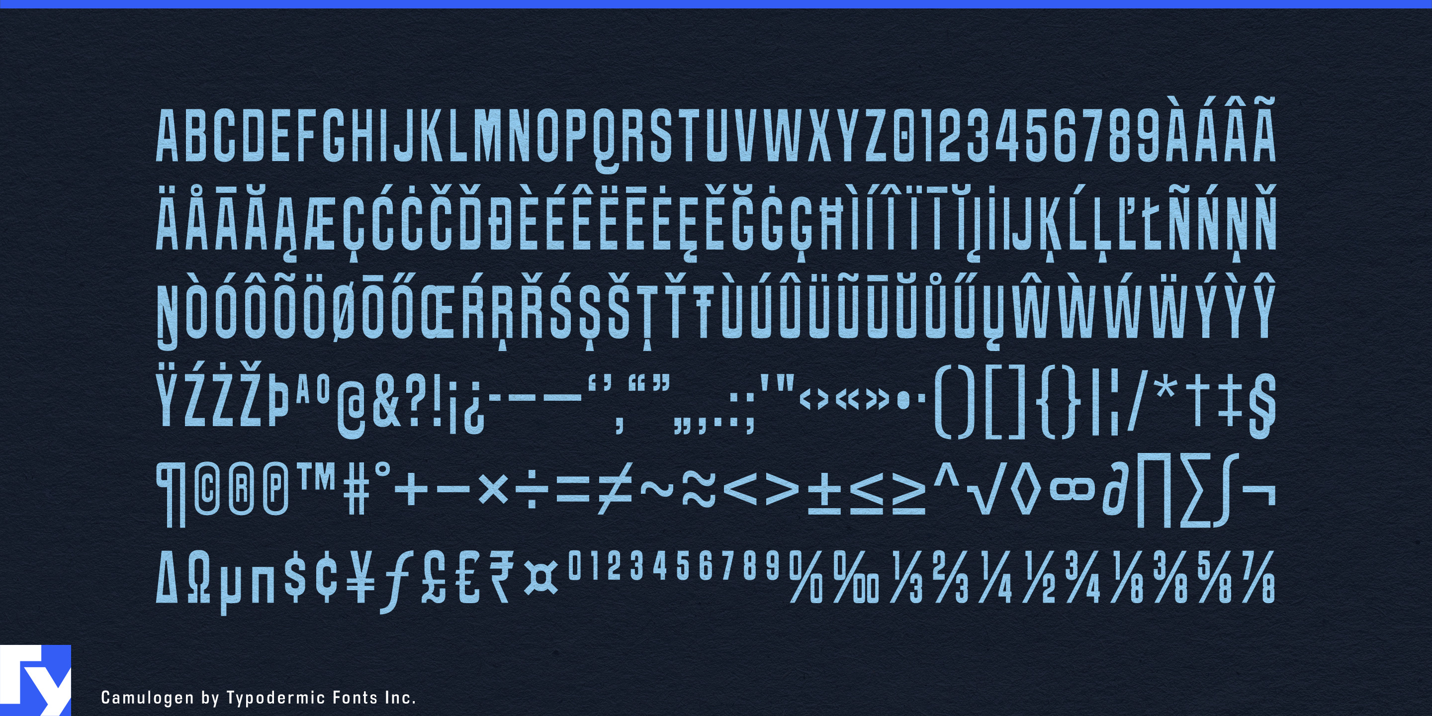


Camulogen is built for headlines that need to occupy space. Its compact proportions let substantial words fit into narrow formats, but the heavy strokes keep the result from feeling economical or restrained. Set large, the letters form dense bands of ink; slight irregularities in the curves and stroke widths prevent those blocks from becoming sterile. The effect becomes especially strong in bold color schemes, where the typography can do much of the graphic work before illustration or ornament is added.
Performing-arts campaigns are natural territory. Theatre seasons, contemporary circus, dance festivals, comedy programmes, and cabaret events often need production titles to survive across street posters, transit advertising, building banners, programme covers, foyer screens, and social promotions. Camulogen can turn those titles into large blocks of saturated color while its compact width leaves room for long names and changing event information.
Film festivals present the same problem across a larger system. Dozens of film titles, programme strands, venue names, catalogue dividers, and daily schedule posters all need to feel related without becoming repetitive. Camulogen’s dense construction lets typography become the campaign image itself, with each title filling the available space with the weight of a printed poster.
Combat and exhibition sports can use that same mass more aggressively. Boxing cards, wrestling events, strongman competitions, track cycling, and special exhibition matches need fighter names, bout titles, arena banners, weigh-in graphics, merchandise, and broadcast promotions. Camulogen brings the force of event-poster typography without relying on collegiate lettering, military stencils, or distressed athletic clichés.
Bold food and beverage systems offer another strong use. A canned aperitif range, tonic line, confectionery series, preserve collection, or specialty pantry brand can assign a saturated palette to each variety and let the product name become the dominant label element across cans, cartons, tins, shelf displays, and campaign posters.
Food halls and market-style hospitality can extend the same language into space, using color to distinguish bakery, butcher, oyster, produce, rotisserie, and prepared-food sections while Camulogen holds department names, hanging signs, wall graphics, packaging, and seasonal promotions together.
Camulogen is most effective when the letters are expected to carry the color. It gives posters, packages, banners, walls, and event graphics a dense printed presence, turning short headlines into substantial pieces of the composition rather than simply labels placed inside it.
Get Camulogen
Desktop licenses cover print, logos, and static graphics. MyFonts also offers embedding licenses for websites, e-books, and applications. Embedding licenses
Commercial font facts
Family details
- First released
- 2012
- Styles
- 1 style
- Version
- 1.000
- Formats
- OTF
- Class
- Sans serif
- Width
- Condensed
- Case
- All caps
- Scripts
- Latin
- Role
- Display
- Features
- Distressed
Commercial style names (1)
- Regular