
Misadventures
Get the font


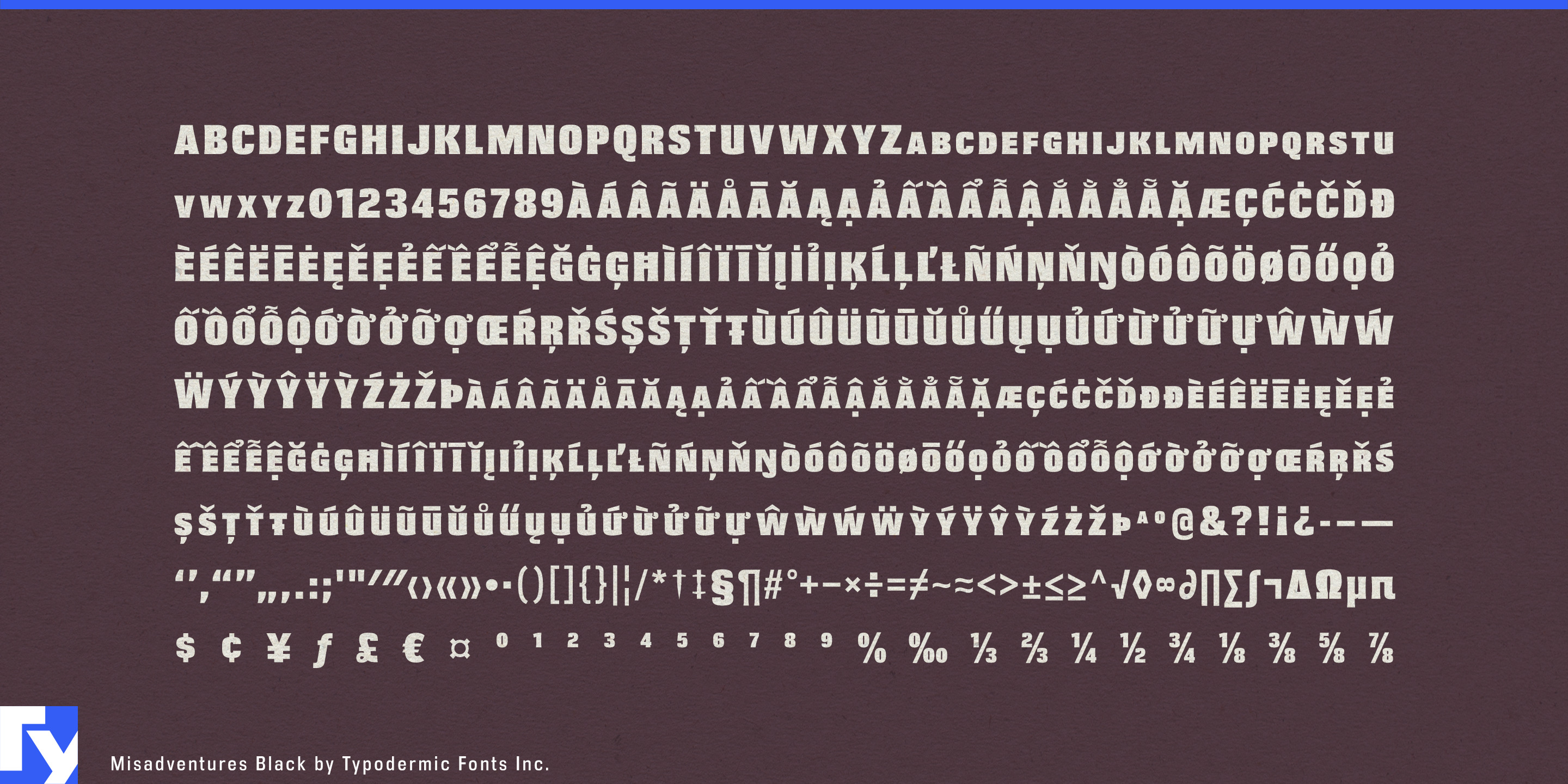


Action lettering often works brilliantly at the top of a poster and runs out of usefulness a few lines later. Misadventures was originally commissioned for an action game, drawing on the scale and impact of cinematic title lettering, but its blocky small-cap construction gives it more range than a one-line bruiser. Set a title in capitals and it becomes a dense, imposing headline; mix upper- and lowercase input and large initials rise above smaller capitals, creating a built-in hierarchy for names, locations, model designations, credits, and short supporting lines.
The underlying shapes are heavy and angular, with a stencil influence that stops short of conventional military lettering. Small flares and sharp interruptions break up the rectangular mass, giving the letters a cut-metal, cinematic quality rather than a purely digital one. The italic carries the same structure into a more directional silhouette without abandoning the family’s basic shape.
That makes Misadventures particularly useful for action entertainment where one visual identity has to stretch across an entire campaign. Game key art can carry a massive title, then reuse the same lettering for mission headings, character introductions, location cards, chapter screens, trailer graphics, and promotional thumbnails. Action-thriller campaigns can move from the main title into cast names, episode graphics, stunt promotions, and short credits without switching visual languages.
Combat sports present a similar problem. Boxing, MMA, kickboxing, and wrestling graphics constantly alternate between event titles, fighter names, weight classes, bout pairings, countdowns, and statistics. Misadventures can make the main event enormous without forcing every other piece of information to shout at exactly the same scale.
The same structure transfers naturally to powersports. Motocross teams, rally-raid events, ATV and UTV equipment, snowmobiles, electric dirt bikes, helmets, recovery gear, and aftermarket performance parts all need lettering that can handle brand names, product families, model codes, race numbers, and short specifications. Misadventures has enough mass for vehicle graphics and event displays, while its smaller capitals help organize the naming systems surrounding them.
Its usefulness extends to rugged products such as power tools, recovery winches, protective equipment, and heavy-duty cases, where a manufacturer may need something more forceful than an ordinary industrial sans but still capable of carrying model names and equipment designations. Misadventures is a display face, but “display” here does not have to mean a single giant word.
Get Misadventures
Desktop licenses cover print, logos, and static graphics. MyFonts also offers embedding licenses for websites, e-books, and applications. Embedding licenses
Commercial font facts
Family details
- First released
- 2009
- Styles
- 2 styles
- Version
- 1.102
- Formats
- OTF
- Class
- Sans serif
- Form
- Angular
- Case
- All caps, Small caps
- Scripts
- Latin
- Role
- Display
- Features
- Stencil
Commercial style names (2)
- Black
- Black Italic