
Warugaki
Get the font


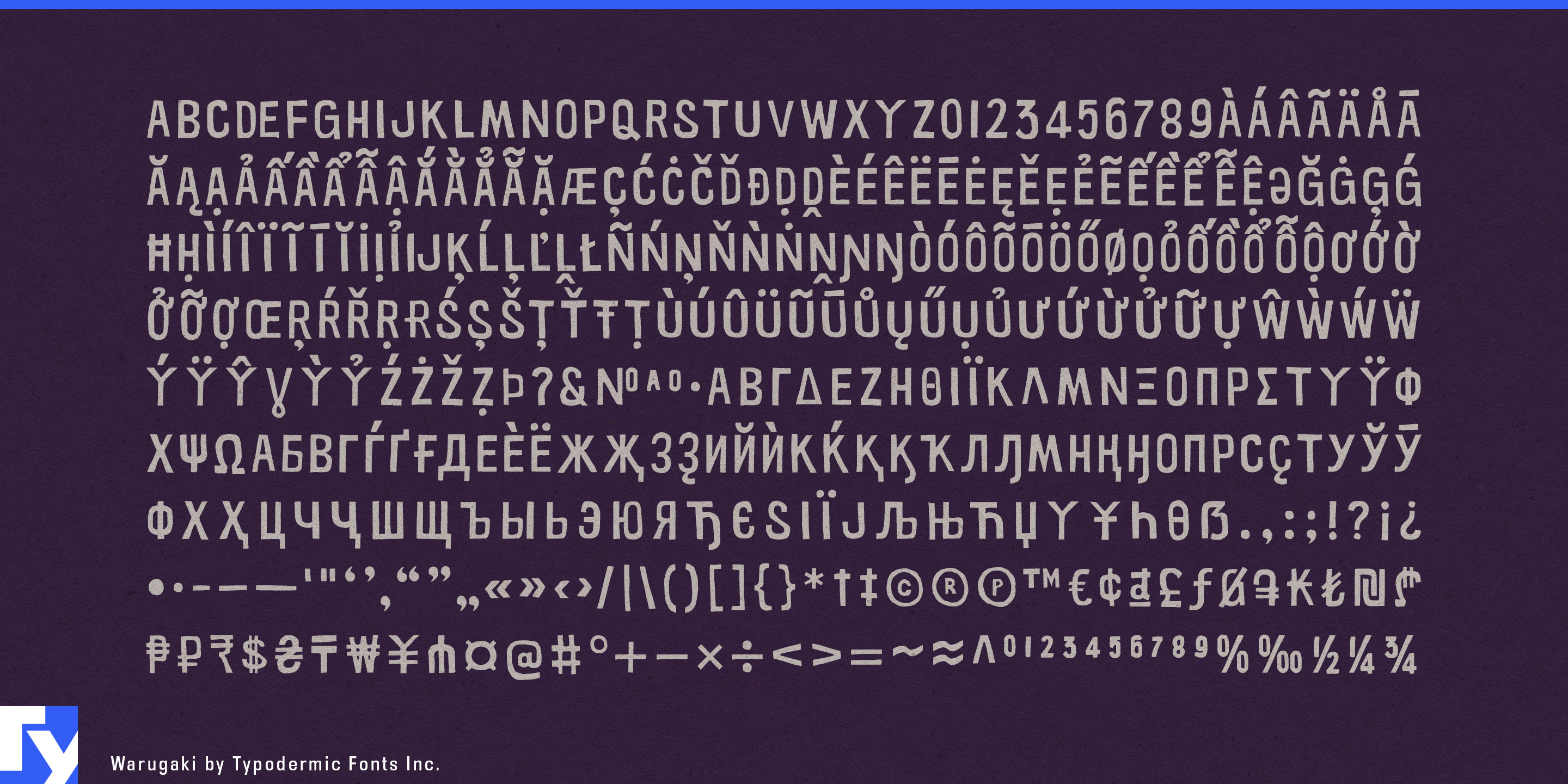


Warugaki is for Japanese heritage projects where the English lettering needs to belong to the period too.
A carefully researched Shōwa-era identity can fall apart when contemporary Latin typography is dropped beside old Japanese graphics. A clean modern grotesque looks newly added; generic distressed lettering can push the design toward American workwear or punk; faux-Asian details turn the Japanese connection into caricature. Warugaki takes another route. Its compressed rhythm, carved negative spaces and rough printed surface draw on mid-century Japanese display lettering while remaining unmistakably Latin.
That makes it especially useful for Japanese automotive and motorcycle heritage. Manufacturer museums, historic-model exhibitions, anniversary campaigns, heritage-parts programs and archive merchandise often combine newly written English with photographs, advertisements and brochures from the 1950s through the 1970s. Warugaki can handle model names, decade headings, exhibition titles and campaign phrases without making a Japanese motorcycle or compact car look as though it came from an American hot-rod shop.
Camera, audio and electronics archives offer a similar role. Japanese camera makers, hi-fi companies, musical-instrument manufacturers and consumer-electronics brands can use Warugaki for model-family headings, dates, anniversary graphics and short display phrases that need to sit comfortably beside period product photography.
Film, television and games set in postwar Japan create an even broader need. A fictional Shōwa shopping street may require English shop names, advertisements, nightclub signs, sports graphics, product labels and factory markings alongside Japanese text. Warugaki provides a repeatable display language for that world-building without pretending that Latin letters are kana.
Museums and cultural exhibitions can use the same qualities for projects concerned with postwar Japanese industrial design, household appliances, motorcycles, railway travel, record culture and everyday Shōwa life. Japanese baseball heritage offers another natural fit through throwback-game identities, stadium-history displays, anniversary merchandise and archive campaigns.
Long-established Japanese consumer brands can also use Warugaki when revisiting old packaging, mascots and advertisements for anniversary editions or limited campaigns. Newly created titles and promotional phrases can coexist with the originals without looking digitally immaculate.
Warugaki is not a generic Japanese-style font. Its job is narrower: helping new Latin lettering look as though it belongs beside the signs, products, vehicles and printed matter of postwar Japan.
Get Warugaki
Desktop licenses cover print, logos, and static graphics. MyFonts also offers embedding licenses for websites, e-books, and applications. Embedding licenses
Commercial font facts
Family details
- First released
- 2010
- Styles
- 1 style
- Version
- 2.000
- Formats
- OTF
- Class
- Sans serif
- Width
- Condensed
- Scripts
- Latin, Greek, Cyrillic
- Role
- Display
- Features
- Distressed
Commercial style names (1)
- Regular