
Zamora
Get the font


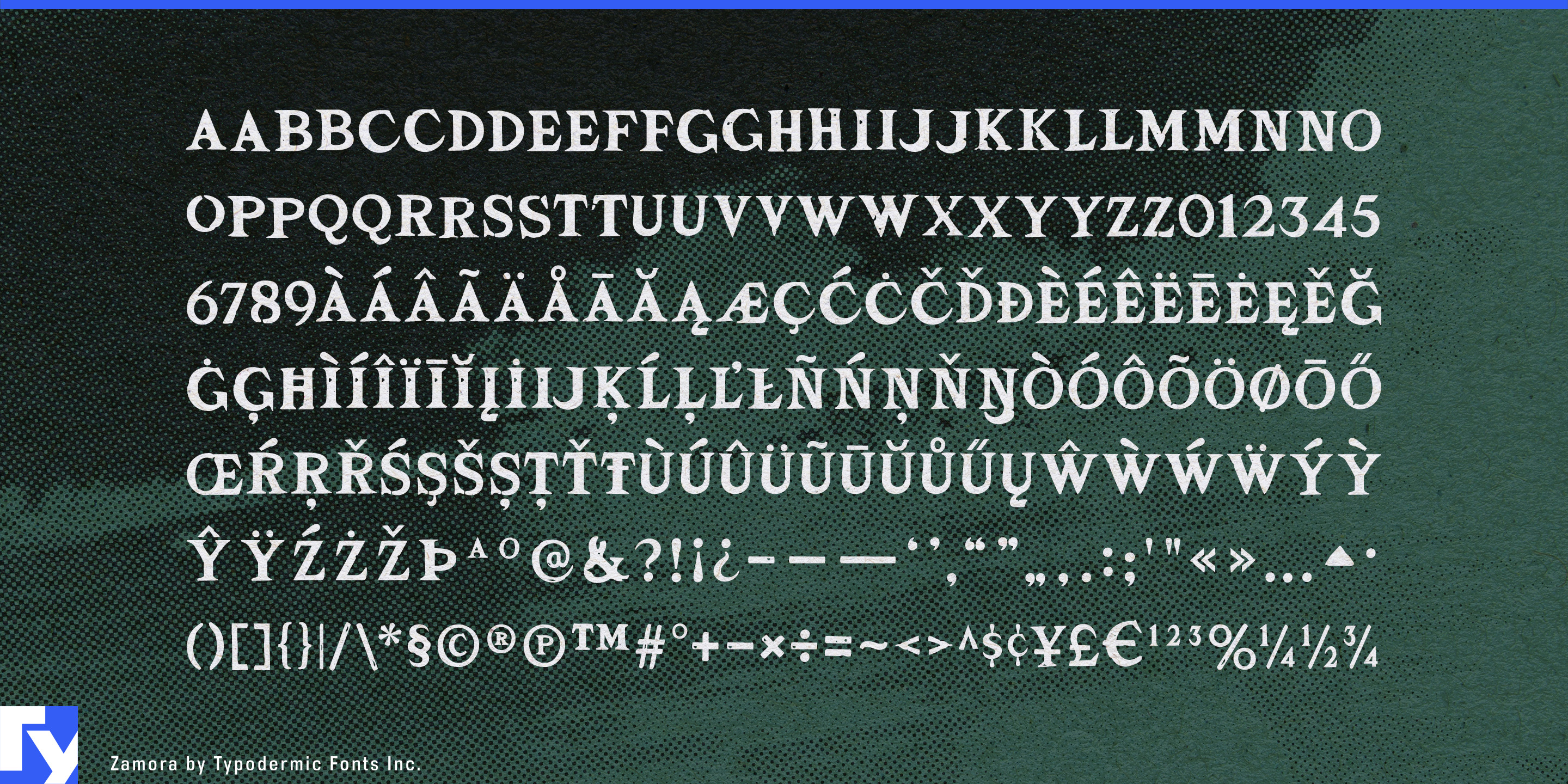


Rock typography often confuses wear with destruction. Blackletter, splatter and brutal condensed capitals can make a guitar product or touring identity look heavier and more hostile than the music; a clean serif can feel too polished to belong near a stage, workshop or road case. Zamora keeps the poise of a sharp wedge serif, then chips the surface just enough to feel played-in rather than wrecked.
Small notches and worn edges interrupt the letters without dissolving their structure, so names remain clear while gaining the texture of equipment that has survived rehearsals, loading docks and long drives. The underlying forms are composed rather than chaotic; Zamora brings grit without automatically suggesting horror, extreme sports or the heaviest end of metal.
Guitar equipment gives that balance a practical role. Pedals, amplifiers, pickups, speaker cabinets and effects processors need short product names that can become recognizable marks on enclosures, faceplates and packaging. Zamora can give a pedal series or amplifier model a rock-and-roll identity while a neutral sans carries control labels, specifications and instructions.
The same distinction matters as more guitar equipment moves onto screens. Amp modelers, cabinet simulators, software effects and connected pedalboards can easily resemble ordinary software or consumer electronics. Zamora brings the rehearsal room back into product names, preset collections, expansion packs and campaign headings without interfering with the functional interface beneath them.
Music publishing creates another problem: one project may need dozens or hundreds of song titles that feel related without looking mechanically identical. Zamora can establish titles across guitar chord sheets, artist songbooks, rehearsal libraries, tour binders and lesson platforms while lyrics, chord symbols, diagrams and notes remain plain and functional. Its built-in ligatures vary recurring letter combinations, helping repeated headings retain the feeling of designed lettering.
Custom motorcycle builders, component manufacturers, touring-luggage companies and riding-gear brands face a similar choice between neutral industrial type and theatrical blackletter. Zamora suits tank graphics, parts-series names, leather patches, catalogue covers and product packaging with a road-worn tone closer to touring culture than outlaw-club costume.
Zamora is built for guitar products, song-title systems, touring identities and motorcycle-related brands that need evidence of use rather than evidence of destruction.
Get Zamora
Desktop licenses cover print, logos, and static graphics. MyFonts also offers embedding licenses for websites, e-books, and applications. Embedding licenses
Commercial font facts
Family details
- First released
- 2005
- Styles
- 1 style
- Version
- 2.107
- Formats
- OTF
- Class
- Serif
- Scripts
- Latin
- Role
- Display
- Features
- Distressed, Ligatures
Commercial style names (1)
- Regular